Walden Farms Syrup Redesign
For this project I was tasked with choosing a single product with a package label to redesign and creating three different variations out of it. I found a higher end pancake syrup that I thought was very lackluster in the way that it looked. To make them all fit a theme I chose fruit flavors instead of sticking with the original pancake one. I made versions with colored caps and ones that have just plain black caps.
Final Outcome


Dielines


Initial Sketches and Digital Iterations
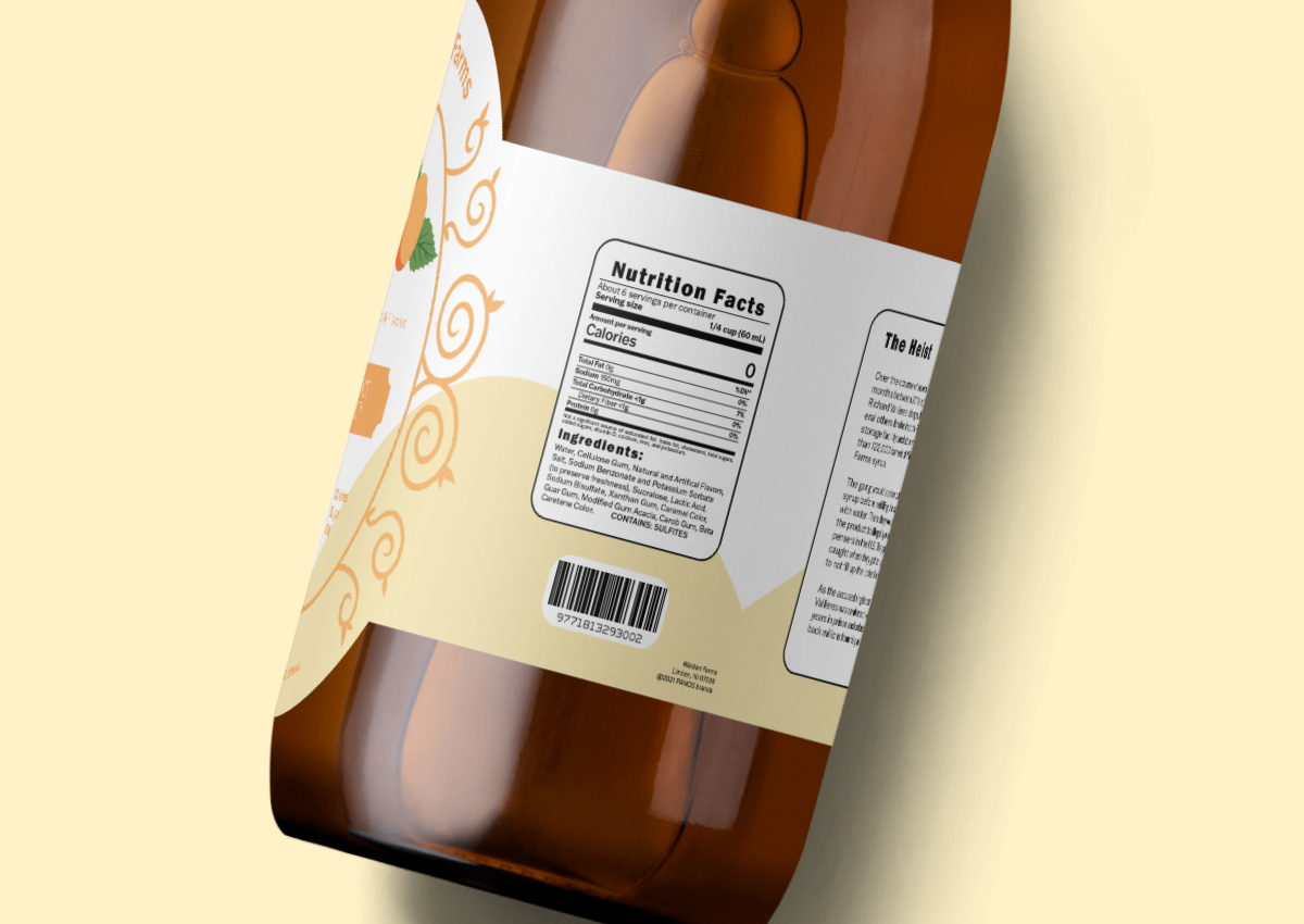
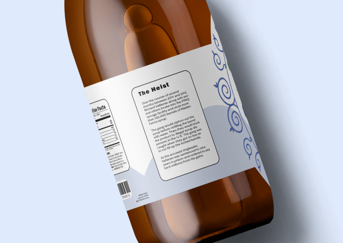
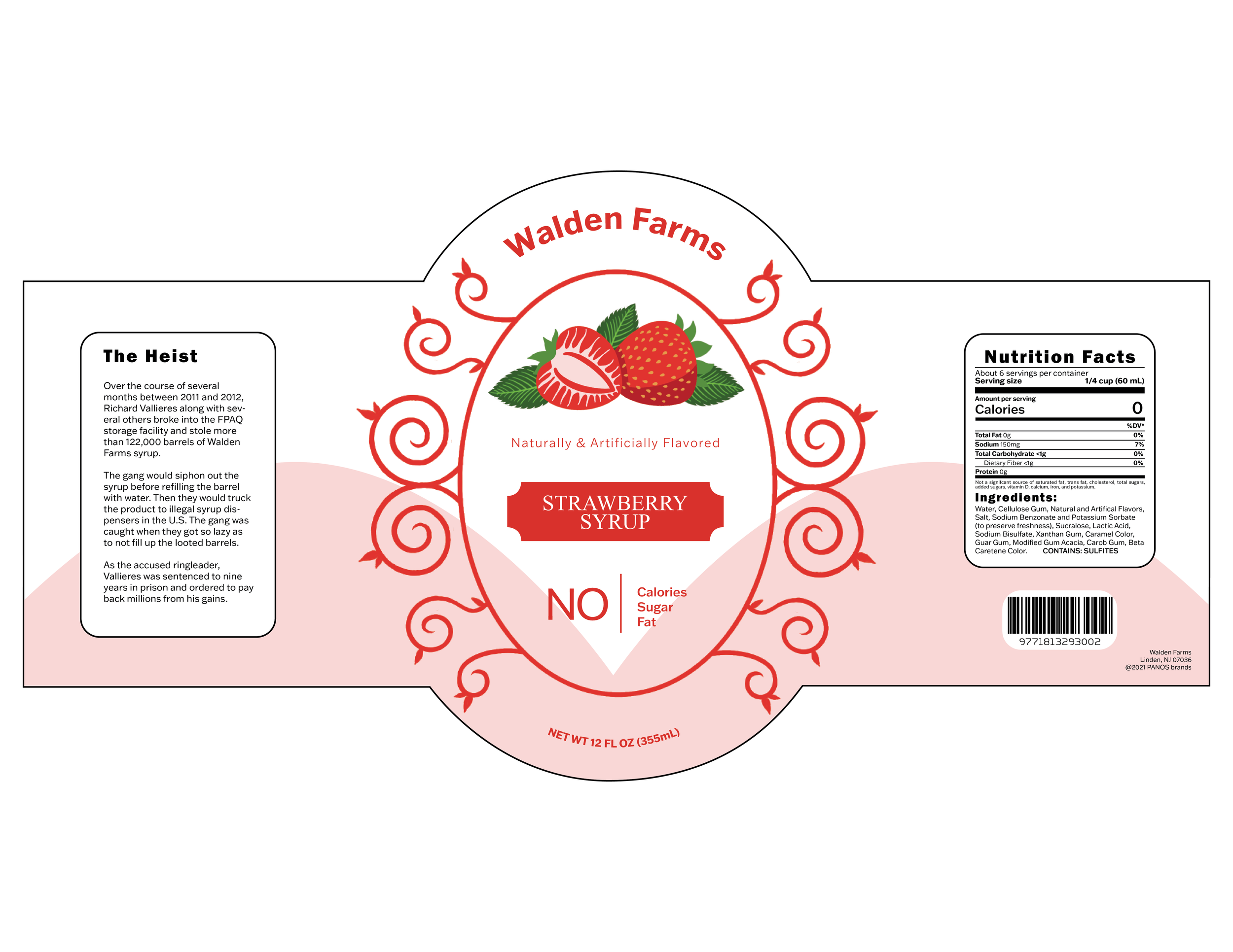
I first started with small thumbnails to figure out what direction I wanted to go with. Once I had two solid ideas I drew each of them to scale so I could see if anything was too big or small. I then cut them out and wrapped them around the original syrup bottle to see how they looked and if anything needed to be changed. At this point I began working digitally and I knew I wanted to make the product look fancier than what I had been making before. The most challenging part was figuring out how to arrange the information on the back of the label.
I thought it would be interesting to have circles cut out of the paper to see the syrup easier however I ended up scrapping this idea. The last few changes I made involved making the oval shape in the center slightly rounder so that it better matched the shape of the die-line. I then added curved text to fill in space on the top and bottom of the ornamentation. I also made the fake story I created slightly shorter and increased the size of the text in the nutrition facts section.


Original Design

